-
Architects: Jose Gutierrez
- Area: 300 m²
- Year: 2013
-
Photographs:Jeremy Toth
Text description provided by the architects. The brief was to turn an existing rundown mechanics workshop into a showroom/headquarters for Mildred & Co. It needed to be a neutral flexible space that could be leased out for events but also bold enough to define their brand.

The building is a warehouse located in a gritty urban setting, wedged in-between 3 buildings. The solution to the brief focused around a study on scale, proportion, as well as controlling light, reflections and acoustics to provide a successful outcome.

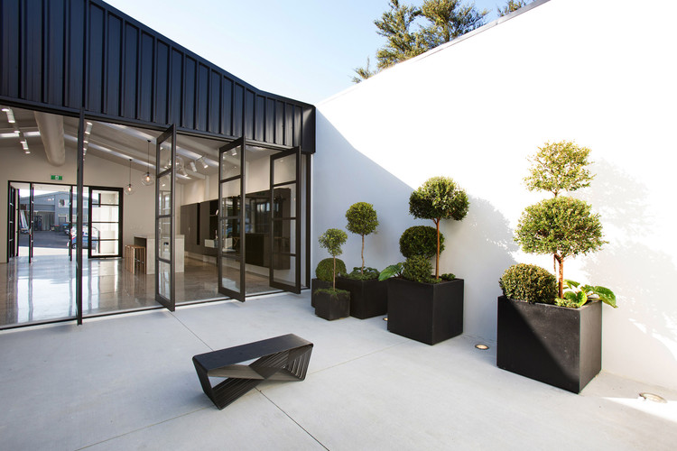
The form of the original building was retained and new sections of building were added around the perimeter of the site to create a courtyard. The courtyard gives a sense of release and openness within the surrounding dense urban fabric. The front façade was re-clad and reformed to give a more discrete but also robust face to the street. The black cladding was selected to turn the façade into a shadow, giving the sense of a void, a negative space. This was done to create a strong contrast between the inside and outside / public and private realms of the building. The internal space of the building is about creating architecture through the manipulation of light, reflection and scale.

The completed building consists of an entrance lobby, showroom, courtyard, office, storage area and amenities. These spaces are all defined by variations in volume and scale. The physical transition into each of these spaces is a defined experience. Stepping through to the courtyard becomes an architectural experience; the threshold remains defined but still allows for movement through the space.

The surface finishes have been carefully selected to create reflections and enhance the movement in the space, high gloss black lacquer cabinetry, hyper polished concrete floors, glass pendants all contribute to this.

The timber battens in the ceiling serve to hold up acoustic insulation, filter natural light and also create a pattern that gives the space a more human scale. They mimic the negative and positive undulations in the old corrugated iron roof.

The pivoting doors and cabinetry were conceived of as sculptural pieces in their own right; these are designed to create a dialogue with the architecture in both their open and closed states. Their configurations transform the dynamic, mood and architecture of the space.

The overall idea is that it is not just one stagnant space, every aspect of the design has been rigorously considered to create a dynamic space that can be experienced in various configurations.


